Sunday, September 11, 2011

Remembering 9/11


Above: This is me, 9 years ago at Al Udied Airbase, Qatar.


I was on my way to work, I was apart of the A-Break on Day shift at the Culpeper Juvenile Correctional Center and it was going to be my second shift working this group. It was like any other day.

My life leading up to that point was pretty wide open. I didn't know what I wanted to do. I thought for the longest time that I was going to be a military officer, everyone that knew me in high school thought the same thing.

I was accepted at Norwich University Corp of Cadets which has made several military officers in the past. I was certain to to be a military lifer. It seemed that I had a grip on my future, but I had a way of throwing a wrench in, even on my own, plans. I decided just months before going to school to enlist in the US Coast Guard Reserves so I could have a leg up on my fellow classmates.
In the end it proved to be a fatal move, I was tired after basic training with the Coast Guard and I realized that I really did not want to go through a whole year of military training. I was a restless spirit and I wanted to see what the world had to offer. So it was not a surprise - looking back now at least - that after two weeks in the Corps of Cadets that I dropped the Corps and went back home to Virginia.

After arriving home, I enrolled at the local Community College and improved my grades. Later, I made a big decision on the 29th of June, I transferred my military branch from the US Coast Guard to the US Air Force (VA Air National Guard).

Not long after enlisting with the Guard I was offered a job at the Culpeper Juvenile Correctional Center and I thought that it would be a great opportunity - my major was Criminal Justice and I thought "why not?" I would do it while in college and then apply for the police department.

That morning ten years ago I walked into work and started getting ready for the shift. The shift went like normal, get the kids to breakfast and then school. After getting the kids in classes for the morning we went about doing small chores and an odd jobs - I cannot recall what jobs we were doing - but I remember being in the nerve center at one of the buildings and we heard the news from one of the other officers that the Towers were hit. I ran down to the main CCTV room that had a TV to the outside world and we saw the news. We watched in horror as the towers were on fire. Then suddenly about an hour later we saw the unspeakable.....the towers collapsed.


Just hours before, people were going about their business. It was just another day. My life plan was set, at least I thought.


Suddenly everything was thrown into chaos....as the hours wore on the news kept getting worse.


A plane hit the Pentagon and then another crashed in Shanksville, Pa. it seemed like a page out of a video game plot or something. Nothing seemed real.

In the days after, my life would be changed. I would be activated by the Air Guard on Sept. 14th and the next 10 years of my life would see me going to Al Udied, Qatar, Krikuk, Iraq and would end with me going back to college finally. But I would finally be going to school doing something that I love: art.

From Sept. 14th to June of 2007 (when I was finally out of the military) I would b e activated 6 times, deployed to Qatar, New Orleans, Iraq and altogether I would serve 33 months on Active Duty. I wouldn't change a thing when I think about it.

For the first five years after 9/11 I flipped back and forth from being on active duty and being a civilian. Each time I was deactivated I would try to re-invent my identity. I was a security guard, a salesman, an insurance agent, a delivery driver and finally a washroom operator in a factory washing thousands of uniforms.

In the years after 9/11 I never took my life for granted, I was always aware of the gift that I had: life. Yet, it was a war in Iraq that made me realize what my calling was. I have written about a thousand times on here before but essentially, I learned that I was - and always had been - an artist.

My father, my mother, my siblings and even those all around me thought that I was an artist. When I finally realized that myself, I suppose that I made the best choice that would honor my fallen brethren: living out your passion.

If there was one thing in the last ten years that 9/11 has changed in me, it was the determination to live my life to the fullest and do what I was meant to do. Had there been no 9/11, there would not have been an Iraq, and no Iraq then no change in job and no self-discovery of being an artist. I would still be selling.....stuff!

I think I was one of the lucky ones.....of all the things that could have happened to me. Of all those who lost their lives.....somehow I managed to find myself.


ABOVE: "Reminisce: Iraq and Me" Watercolor, 11"x15". For today, this image seems perfect.

Monday, June 6, 2011

Importance of Understanding Watercolor Properties

Whew! It's been a little while since I was able to post work on here but we have been so busy with everything and hardly had anytime to get anything posted on here.

The month of May has been good to us and from the end of school to the beginning of June we have sold 3 paintings, did 3 photography gigs and sold 24 ceramic pots. It feels good to have that accomplished and a great way to start off the summer. Especially since no one around here is hiring anytime soon and the college kids who stayed behind are competing with a lot of local high school students to get jobs. Good thing we have art to always help pull us through :).

So recently, we went to a fest in Roanoke, VA for the "Local Colors Culture Festival" and it was a great time. We always enjoy meeting new people and listening to their stories and backgrounds. The great thing about a fest like this however, is the amount of photo reference materials we can amass and later work from :).

We must've taken hundreds of photos and below are a few examples of some of the pictures that I, Jerry, took. I like to pick out people who are characteristic, have strong cultural features (ie hats, burkas, etc.) and can tell a dialogue without me explaining a lot.

Above: "The Man in The Park", Watercolor on 140 lbs Paper, 11"x14", $225.00 (Demo at the end)

I selected this fellow because I liked the expression on his face and it was a candid shot - all my images are striving for the candid as I feel that tells more about people than any posed shot. I liked how the lighting was shining down on him - typically photographers love shooting in overcast weather but artists like myself love the contrast. The one thing that you may notice in this painting and in the ensuing paintings are the amount of various colors that I have started to incorporate a lot more of. We're going to look at that and how watercolors properties play a vital role in your work.

Now, here is the big question that I get a lot from other burgeoning artists: "how do you get that skin tone?" And "how do you do it without lifting layers of Watercolors off of the paper?"

Well to begin with, everyone should invest in a Watercolor Journal or Sketchbook of some sort. I try to keep one with me at all times and even if I don't have watercolors with me, I can at least sketch out my next idea. I also have my moleskin journal that stays with me 24/7.
Above: "Study for A smile in the Darkness", Watercolor Journal, 11"x14"

In this study I looked at not just what I am going to paint but at "how" am I going to go about constructing this piece. When you practice enough drawing each day you will find that making a "likeness" of someone or drawing something right becomes second nature and you can focus on how you are going to go about the colors and values - that is why it so important to practice drawing daily (even if you are good at it).

In the above journal entry you see some handwriting where I note what colors I used and in what order. I put down:

1st Layer - Veridian Green (Translucent Color)
2nd Layer - Mauve (Translucent)
3rd Layer - Raw Sienna (Sedimentary Color)
4th Layer - Burnt Sienna (Sedimentary)
5th Layer - Burnt Umber (Sedimentary)
6th Layer - Payne's Gray (Opaque Color)

Notice something, notice the order I have done this in. I don't have translucent over Sedimentary or Opaque on an early level but at the last layer. Why?

In the parenthesis I put the type of watercolor they are and these are the characteristics of these certain colors. Here is a lisiting:

Translucent: Uses the white of the paper to shine through in the colors. Fine grain and very smooth usually a lot of pigment and less filler (varies with each brand and grade). Great for glazing and I try to do as much work as I can in translucent before layering on any sedimentary color.

Sedimentary: Not as translucent, usually your earth brown colors - like Burnt Sienna/Umber, Raw Sienna/Umber and even French Ultramarine/Cerulean Blue are sedimentary color. They are not great for glazing because, like their suggests, they have tiny particles - or sediments - in the paint that settle into the pockets of the paper. When you put another layer of paint over them, you better limit it to one layer otherwise it will begin to lift the paint up including anything below it. So be careful with your use of it.

Opaque: Not translucent and not great for glazing either. I have watered down Payne's Gray before and painted over it but that was for an effect. However if you put it down first, like any other dark color it will show through, it is not like oils or acrylic where you can just cover it up. Opaque colors I use last and that is mainly for detail work - just as in any other style of realism you save the details for last! The danger in using these opaque colors, too, is that if you go too heavy it will create a heavy body on the surface covering any translucent or transparent quality to your painting thus looking more like an acrylic instead of a watercolor painting.

After spending some time looking at how I was going to go about making this piece I put it to practice here:

Above: "A Smile in the Darkness", Watercolor on 140lbs Paper, 11" x 14", $225

Also, for the background, I like to use the same colors again as it creates color harmony in the image.


Above: Study for "The Christian Man"

The same process is applied here in this study of a Christian Man we met in the park. I did a small sketch in my journal and spent some time just working on what colors and which translucent colors I want to have "stick out".

Something I try to tell my students, is to allow for cool colors to exist in your paintings. Let the greens, purples and blues share the same space as it will allow for your work to come alive.

In the Christian Man, I allowed for a lot a of Veridian Green to pop. I also left my brushstrokes present so that it could add character and texture (do not feel as if everything needs to be smooth).

The Result: "The Christian Man", Watercolors on 140 Lbs Paper, 16" x 20", $295.00

I was really happy with the results here.

Demonstration: Step by Step

1. I try to knock out as much transparent work as I can in the beginning. First layer is Veridian and I work from dark values to light with it. Then I will add in the Light Yellow (some call it Lime Yellow) and I will working from light to dark as well.


2. After I start off with the Veridian and Light Yellow I will add in the Mauve (translucent) and begin to play around with the values and textures of the face. When mixed, the Mauve and Veridian Green create a nice blue. 3. After the Translucent colors are down I begin to add in my sedimentary colors, I layer them right over the translucent layers but I try to keep some of the cool colors present.


5. After putting in the my earth-brown colors (sedimentary) I start the details and add some touches of cool colors to finish off my painting.


The I'm at the the final result.

I hope this demo was helpful and I hope to post more like this in the future. :)

Saturday, May 14, 2011

Self-Portraits, Commissions, and Social Media

Summer, 1989, I recall waking up on a sunny summer day and the music of John Mellencamp over the radio. I was young, eight to be exact, and the summer had just started, it was not too hot or humid. We did not own a nintendo and I didn't care to have one. I just wanted to get outside and play! Yet, most days I found myself drawing in the living room or on the floor of the dinning room in our home on Lakemont Dr. in Culpeper, VA. My dad would say "one day you will sell your work everywhere."

As an eight year old boy I found that hard to fathom since I only knew a few people and the world seemed like a big place. However, in the recent years we have seen the growth of Social Media in so many ways. Most of us wrote it off as another gimmick or as simple entertainment. Yet, for some of us we see Social Media as a way to get free exposure for our artwork.

Galleries are hard enough to get into, let alone trying to sell a piece. Fortunately for us, we have used mySpace (Not so much anymore), impNow, Facebook, Blogspot and now deviantArt as a way to share our work. We have reached over thousands of people with these sites and they have led to very profitable sales. We have landed commissions through Facebook and most recently on Tuesday we landed a sale off of one of our posts "Cody".

Above: "Cody", Watercolor on Paper, 11"x15", SOLD


Who would've know that back in 1989 we would such technology to do something like this? Through facebook I have sold painting via US Mail, landed commissions and sold our own work (non-commissioned). So perhaps my dad wasn't kinding when he said you are going sale work everywhere.


I think sometimes as artist we allow ourselves to be overwhelmed by technology and the realization as to how big this world is. Yet it is technology that shrinks the world, it brings us together leads us to newer heights and to make sales that we'd never imagine before.


My world has changed and I cannot be happier. Change is something that as artist must embrace. It is like the business owner who resists going online, at some point you go online or you go out. As a side note, as an artist you are a business owner (You Inc.) and if you fail to realize that you too will be slave toyour job and not your passion.


Speaking of change, I have noticed so much about watercolor that I never saw before. My work has grown and my level of realism has soared to new heights. I started off using oils and then switched to acrylics, with each change I saw that my work kept getting better and then ultimately I saw a vast improvement when I went to watercolor.


In oils, you would work your values from dark to light and then layer your colors on. Yet, for me I never followed that too well as many of my paintings were too dark and would turn out flat. As I moved to acrylics I didthe same but since the paint dried so fast I was able to see how the layering worked. Then once I made the jump to watercolor I noticed a big change.


In watercolor you work from light to dark values and add colors as you go. I have reached so many milestones with watercolor and for those following me you have seen the change in my last several posts.


Well, recently I reached a new milestone. I completed a whole painting without blending or smoothing out the paint! In fact I did two of them. The first painting was an attempt to do a self-portrait with my hair down:


Above: "Self", Watercolor on Paper, 11"x15", $225

I like the textures left by the paint strokes, they add a fun characteristic to my painting. The response for this piece was strong on Facebook and on deviantArt (1 in 5 people according to dA "favorited" it). Yet one of points brought up was how this piece did not seem to match my persona. I look angry, depressed and as my wife said I "look agressive". I milled about looking at more pictures of me and finally found one that I really liked:


ABOVE: "Thoughts", Watercolor, 11"x15", $225


The above painting "Thoughts" has been favorited 37 times on dA for an average of about 1 person in 4.8 people who view it. On Facebook many people really saw the likeness and stated that this is "the Jerry I know". I really enjoyed this piece and utilized some new techniques like the rubbing alcohol in the background to create some nice effects.


In the end, this week has been a great one. I was able to sell two painting and get more exposure through free online media. Yet, despite all of the technology and social media the passion of the little boy on the floor drawing still remains and that is the most important thing! Happy drawings! :)


free counters
Free counters

Sunday, May 1, 2011

What a week!

So over the past week we have seen so many things happen. So many historical events in a short span of time: The Royal Wedding (I'm so sick of that) and the death of Usama Bin Laden. Top that with my busy life and all of the excitement of finals week! In the end it has been a long month yet it is a good month. My watercolors just keep getting better and to me that is all that is important to me.


I have just recently finished a painting of Gary Bowlings(a legend as far as I am concerned) and Jody Queen - great friends whose tireless efforts in the Bluefield, WV community has made so many opportunities available to artist like me. For those who have been following my work over the years you know that the Iraq Art show held at the Bluefield Arts and Science Center (Bluefield, WV) was possible because of Joe and his wonderful wife Vicki who not only got the show scheduled for me but also provided the food, promotion and countless hours of sharing my work with complete strangers. Also, last May he and his wife helped my wife's show with the same. All in all I cannot be more grateful for these folks and I felt a painting coming on.

Gary Bowlings, like Joe and Vicki, has been instrumental in our development as well. During our first year at Bluefield College we were seriously thinking about transferring yet I felt that God was telling us to stay - I really think part of that was to give us the opportunity to know Gary and thank God we did. Gary is not just an artist he is a force, something that not every artist has or will ever attain. Gary works on a different level and watching him and seeing work ethic is something else. Over the last two years we attended Bluefield College we found ourselves more and more involved at Gary Bowling's House of Art in Downtown and it was because of this we became better artists and it is what gave us the belief that we could make it as artists.

So as I reflect on these two people I think about how I came to this point.

In the recent months I have been developing a series of paintings about my friends. My wife was watching me work on a portrait and said "Jerry, people are important to you". At that moment I thought "she's right" and that comment gave birth to this new series. Dana pointed out that when the students leave in the spring for summer that I get depressed and I am always trying to get connected to them. I suppose that this is a sign of the "Facebook" era. Being connected is everything. Yet, it is not about the number of "Friends" you have on Facebook it is the stories behind each person and the reasons why you are friends that count and perhaps that is why I am and have always been interested in painting people. So this new series: My Friends.


Above: "Joe", Watercolor, 11"x15", $225


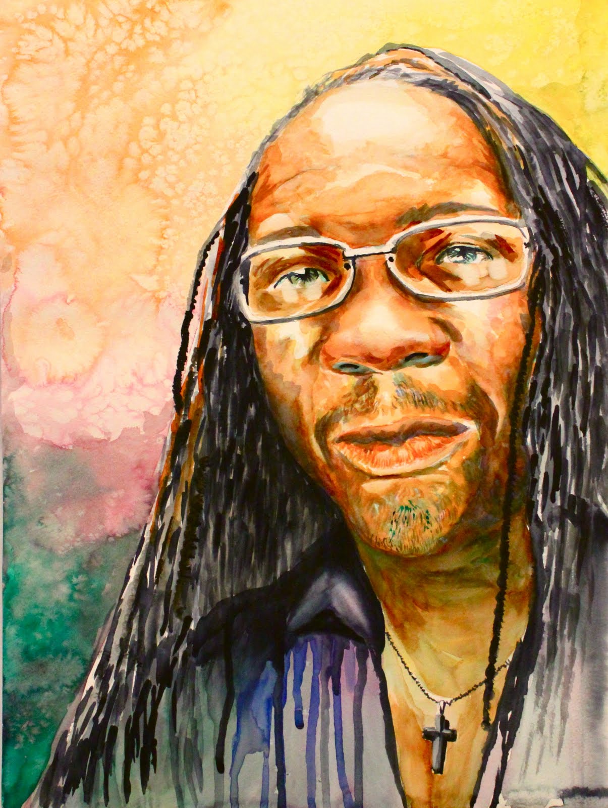
"Gary", Watercolors, 11"x 15", $225

Friday, April 15, 2011

Contrast and Light

One of my favorite things to do with my models is to sculpt them using light. Lighting and contrast are vital to my work as it gives my portraits a very strong appearance.

Good contrast with stark values not only help you during the painting process but also to make your work stick out from across the room. The same goes with lighting, a strong direction for the light source helps to make the contrast complete. If you leave one side out you will find your work lacking that dimensional quality that you are looking for as a realist. However, it is just as important to not leave out your middle tones either, each value is important and if you go too far with one it will be noticed.

I recall when I first started drawing that my drawing always appeared gray. The details were great, but who will ever notice that? All that time spent on details yet people will walk by as if your work was never there because to them it's just a gray drawing. So I moved to charcoal and that made a huge difference, the same can be said about my paintings. I changed my palette around, making a limited color choice and using Payne's Grey as my dark value. The result: "Kerry"

"Kerry" Watercolor on Paper, 13"x17", $225.00

My friend Kerry D. Hatton posed in this piece for me. At the time we were at a banquet for my wife - she restored the Milton Easley Painting at Bluefield College Library - and the lighting in the room was low. The way the light hit his face along with the structure of his face just added up and I had to turn that moment into a painting. Good thing I already had the camera with me!

So, I hope you enjoyed today's post. Always be on the lookout for special moments in life, you never know what will lead to your next best piece!

Saturday, April 2, 2011

David Bowie, Freddy Mercury and Watercolors....

So today, I woke up with "Under Pressure" singing in my head. I love Queen and David Bowie, two of the best artists to have ever taken the stage. I love Freddy Mercury's voice stage presence and watching their "live" videos on youtube is such a breathe of fresh air from all of today's computerized auto tune rubbish and one million background dancers. I loved the charisma and presence that Freddy Mercury was able to put on and he did it without the whole Mickey Mouse club dancing behind him. Love love love Queen and Bowie!


So anyhow, onto art. I had Under Pressure on in the background and I was feeling experimental today with my art. Typically, for those who follow my work know, I paint realism and my style is tight and very little spotaneity. I like having control of the medium no matter what medium it is. Well today, while listening to Under Pressure I felt like I wanted to just leap out and try something else today and the result was - as my wife would say - powerful!


I think today's piece turned out especially well and I love the spontaneous drips, the effect of the salt and the high contrast of the face - no DETAIL!!! I love that, it is very much like my sketches that I've done of it.


Well, this piece is untitled but it is partly inspired from my Iraq series yet it is totally up to the viewer to interpret, enjoy:


"Untitled", By Jerry Frech, Watercolor on Paper, 11"x15", $125.00

Thursday, March 31, 2011

No Where to Go, No Money to Spend.....so PAINT!

So, as some of you may know, I am a Graduate Student at Radford University and I study under Z.L. Feng. I chose RU because I liked Feng's style and realism he achieves with such an unpredictable medium. Also, there are not a lot of schools with professors that teach realism within the region I live. I am glad I came to RU and the results are beginning to show. In the last month I have produced watercolor after watercolor! I have made 5-7 portraits and I will share then on here as time permits.

So, today's painting is still in progress and it is based on a friend of mine, Keenan Rainier. A year ago I was hired by his band Flight 24 (www.webs.flight24revolution.com) to do a photo shoot and one of the photos stuck out to me and said "paint me".

So, today, with both of my classes canceled and nowhere to go and no money to spend I was able to start! Last night I printed a few pictures on the image and I also did a few sketches to get prepared. After a few hours of prep work I was ready.

I did a placement sketch and made sure all of my pieces were correct. Then I began the painting and the result thus far:

I love the skin tones and the dark-darks and how the various reds, greens, yellows, blues and purples stick out as well. I am pleased and there will be more to come!

Will post a more "finished" piece tonight so check back then!

Tuesday, March 29, 2011

New Painting

"Nunez", Watercolor on Paper, 11"x15", $125.00

Recently, I have been working with Watercolors and I am beginning to think that it is now my favorite medium. I like the level of realism, control and ironically the spontaneity that comes with watercolor. These elements are truly fascinating and I find them to be beneficial in this new series that I am painting.


The Series


As you saw with the last two paintings - Reminisce and New Generation - I have done portraits with developed backgrounds and not the typical soft gradient background typically associated with portraits. In the past I would find myself doing the soft gradient backgrounds and the emotional effect (the ability to emotionally connect between the viewer with sitter) seemed to be lost, as if they were looking at an idealized image of the person. I wanted to really breakout of that and show honest and real people with real stories.


Nunez


In my new work titled Nunez I wanted to really show emotion and the best way to do that is by the look on his face and more importantly his eyes. I have painted Nunez before and used his image in politically charged themes trying to showcase his Dominican heritage while also sharing his story about being an American Service Member. I don't know if I had achieved those effects because they were either too overt or the background was an afterthought. As I pondered this I thought about backgrounds and decided to paint in the background a view of Iraq from one of the Towers in Iraq that we were posted on together. I wanted to showcase a little bit of a story but not too overt and more importantly a background that was not an after thought. I wanted a background that played a nice balance that helped to show my experiences with Nunez and his experiences in Iraq. In the end I think I accomplished more in doing less, and that is what art is about: problem solving.

Saturday, March 19, 2011

The Joy of Watercolor!

Above: "Reminisce" Watercolor, 11" x 15", $125.00 (Prints Available $30) For many years I have avoided Watercolor as a whole. When I was young I hated the lack of control I had over the medium and that bad experience carried all the way through college. During my college years I had the chance to go to a watercolor workshop and I tried out the medium and I immediately recalled all the reasons why I hated watercolor. However during my senior year of college I looked at several Graduate Schools, hoping to find a school that taught "realism", which is my style. I also wanted a teacher that specialized in water mediums. My search resulted with me going to Radford University to study under ZL Feng, a world re-nouned watercolorist. Despite my fears, I decided that it was now or never and after taking the plunge you can see that my decision has paid off. Above: "New Generation" Watercolor, 11" x 15", $125.00 (Prints Available $30) I have found that I can achieve a greater level of clarity, contrast and realism. For many years I felt that I could not do watercolor because I had no control, yet with Feng I found that control. Part of it was also due to my maturity and progression as a painter, I went from an Oil painter to an Acrylic painter - which is not too drastic of a change. During the year I was doing acrylic I found many techniques that worked and found a knack for working the medium. All of this combined with Feng's instruction has led me to a strong portfolio in Watercolor. The two paintings above are among my first 8 watercolor paintings ever! I think the key in watercolor is patience and understanding how to control the paint and a lot of that comes from attitude and careful preparation. I hope to post more Watercolors on here soon so stay tuned for more!

Sunday, January 30, 2011

Janurary 31, 2011

For most of you, you know that my mom is sick and in the hospital with Amyloidosis - a rare disease that is without a cure at this time - and so to begin with I'd like to thank everyone who has been sending support, the kind messages, thoughts and prayers have been felt. Now, as you can imagine my morning sketches have been sluggish for obvious reasons.


Well, knowing my mom she does not want me to stop on her behalf and if she knew that I did stop - she'd kick me! So here we go:

Recently I have been working on a study of textures of Rhinos and Elephants for what will be a bigger series of paintings. The above will be on a larger canvas and will be of a whole elephant. Right now I am doing just a texture study in this monochromatic stage in order to feel out my edges, values and highlights. Later on I'll be adding color! So tomorrow check-in and see how the progress goes and hopefully by friday we'll have color. So, see ya'tomorrow!

Saturday, January 29, 2011

Long Time No Post!

Where has the time gone?
The Wildebeast, Acrylic on Canvas, 8" x 10" SOLD
So it has been a little while since my last post and it was not intentional for that to happen but as with all things - life gets in the way. With the New Year comes new resolutions which include blogging daily. The art of daily sketching has not stopped for me however and in fact my portfolio has grown significantly since then. The past summer of 2010 has been one of our most successful summers ever! We have sold over 40 paintings and lived off of our artwork for the duration of the summer! You cannot ask for a better summer!
As far as subject matter goes in my work, I am still doing a lot of horses but more into the whole wildlife scene. I have done paintings of Rams, Rhinos (lots of Rhinos), Giraffes, Elephants, Zebras and so many types.
Ram Study, Acrylic on Canvas, 8" x 10" Sold
One of the things I decided to do a lot more of - painting studies - because they help me to understand my color schemes and my market. Painting Studies have been done for years, dating back to the old masters, and for me my studies helped me to get more exposure.

Meal Time, Acrylic on Canvas, 8" x 10", SOLD

In the past I would do a study and toss it out or throw it aside where it would take up space or be added to one of our already over ran garbage dumps. So instead of doing that I opted to make the small studies "complete" so that I could take them to the local restaurant - in this case it was "Heritage Cafe" (www.heritagecafecateringandart.com) which is now located in Princeton, WV - where they would sell each week!

Setting Sun, Acrylic on Canvas, 8" x 10", $995.00
By doing this, I was able to reach new clients and sell work to people who I would never have been able to reach. I sold these paintings for only $35.00 for an 8"x10" which made them affordable to everyone. In fact I sold 3 paintings of giraffes to one client! She fell in love with the first one and asked for two more!

The Rhino, Acrylic on Canvas, 8" x 10" SOLD
SO if anything, this summer has taught me to be a business owner, not just an artist. More work to come!