The month of May has been good to us and from the end of school to the beginning of June we have sold 3 paintings, did 3 photography gigs and sold 24 ceramic pots. It feels good to have that accomplished and a great way to start off the summer. Especially since no one around here is hiring anytime soon and the college kids who stayed behind are competing with a lot of local high school students to get jobs. Good thing we have art to always help pull us through :).
So recently, we went to a fest in Roanoke, VA for the "Local Colors Culture Festival" and it was a great time. We always enjoy meeting new people and listening to their stories and backgrounds. The great thing about a fest like this however, is the amount of photo reference materials we can amass and later work from :).
We must've taken hundreds of photos and below are a few examples of some of the pictures that I, Jerry, took. I like to pick out people who are characteristic, have strong cultural features (ie hats, burkas, etc.) and can tell a dialogue without me explaining a lot.

Above: "The Man in The Park", Watercolor on 140 lbs Paper, 11"x14", $225.00 (Demo at the end)
I selected this fellow because I liked the expression on his face and it was a candid shot - all my images are striving for the candid as I feel that tells more about people than any posed shot. I liked how the lighting was shining down on him - typically photographers love shooting in overcast weather but artists like myself love the contrast. The one thing that you may notice in this painting and in the ensuing paintings are the amount of various colors that I have started to incorporate a lot more of. We're going to look at that and how watercolors properties play a vital role in your work.
Now, here is the big question that I get a lot from other burgeoning artists: "how do you get that skin tone?" And "how do you do it without lifting layers of Watercolors off of the paper?"
Well to begin with, everyone should invest in a Watercolor Journal or Sketchbook of some sort. I try to keep one with me at all times and even if I don't have watercolors with me, I can at least sketch out my next idea. I also have my moleskin journal that stays with me 24/7.
 Above: "Study for A smile in the Darkness", Watercolor Journal, 11"x14"
Notice something, notice the order I have done this in. I don't have translucent over Sedimentary or Opaque on an early level but at the last layer. Why?
In the parenthesis I put the type of watercolor they are and these are the characteristics of these certain colors. Here is a lisiting:
Translucent: Uses the white of the paper to shine through in the colors. Fine grain and very smooth usually a lot of pigment and less filler (varies with each brand and grade). Great for glazing and I try to do as much work as I can in translucent before layering on any sedimentary color.
Sedimentary: Not as translucent, usually your earth brown colors - like Burnt Sienna/Umber, Raw Sienna/Umber and even French Ultramarine/Cerulean Blue are sedimentary color. They are not great for glazing because, like their suggests, they have tiny particles - or sediments - in the paint that settle into the pockets of the paper. When you put another layer of paint over them, you better limit it to one layer otherwise it will begin to lift the paint up including anything below it. So be careful with your use of it.
Opaque: Not translucent and not great for glazing either. I have watered down Payne's Gray before and painted over it but that was for an effect. However if you put it down first, like any other dark color it will show through, it is not like oils or acrylic where you can just cover it up. Opaque colors I use last and that is mainly for detail work - just as in any other style of realism you save the details for last! The danger in using these opaque colors, too, is that if you go too heavy it will create a heavy body on the surface covering any translucent or transparent quality to your painting thus looking more like an acrylic instead of a watercolor painting.
After spending some time looking at how I was going to go about making this piece I put it to practice here:
I selected this fellow because I liked the expression on his face and it was a candid shot - all my images are striving for the candid as I feel that tells more about people than any posed shot. I liked how the lighting was shining down on him - typically photographers love shooting in overcast weather but artists like myself love the contrast. The one thing that you may notice in this painting and in the ensuing paintings are the amount of various colors that I have started to incorporate a lot more of. We're going to look at that and how watercolors properties play a vital role in your work.
Now, here is the big question that I get a lot from other burgeoning artists: "how do you get that skin tone?" And "how do you do it without lifting layers of Watercolors off of the paper?"
Well to begin with, everyone should invest in a Watercolor Journal or Sketchbook of some sort. I try to keep one with me at all times and even if I don't have watercolors with me, I can at least sketch out my next idea. I also have my moleskin journal that stays with me 24/7.
 Above: "Study for A smile in the Darkness", Watercolor Journal, 11"x14"
In this study I looked at not just what I am going to paint but at "how" am I going to go about constructing this piece. When you practice enough drawing each day you will find that making a "likeness" of someone or drawing something right becomes second nature and you can focus on how you are going to go about the colors and values - that is why it so important to practice drawing daily (even if you are good at it).
In the above journal entry you see some handwriting where I note what colors I used and in what order. I put down:
1st Layer - Veridian Green (Translucent Color)
2nd Layer - Mauve (Translucent)
3rd Layer - Raw Sienna (Sedimentary Color)
4th Layer - Burnt Sienna (Sedimentary)
5th Layer - Burnt Umber (Sedimentary)
6th Layer - Payne's Gray (Opaque Color)
Notice something, notice the order I have done this in. I don't have translucent over Sedimentary or Opaque on an early level but at the last layer. Why?
In the parenthesis I put the type of watercolor they are and these are the characteristics of these certain colors. Here is a lisiting:
Translucent: Uses the white of the paper to shine through in the colors. Fine grain and very smooth usually a lot of pigment and less filler (varies with each brand and grade). Great for glazing and I try to do as much work as I can in translucent before layering on any sedimentary color.
Sedimentary: Not as translucent, usually your earth brown colors - like Burnt Sienna/Umber, Raw Sienna/Umber and even French Ultramarine/Cerulean Blue are sedimentary color. They are not great for glazing because, like their suggests, they have tiny particles - or sediments - in the paint that settle into the pockets of the paper. When you put another layer of paint over them, you better limit it to one layer otherwise it will begin to lift the paint up including anything below it. So be careful with your use of it.
Opaque: Not translucent and not great for glazing either. I have watered down Payne's Gray before and painted over it but that was for an effect. However if you put it down first, like any other dark color it will show through, it is not like oils or acrylic where you can just cover it up. Opaque colors I use last and that is mainly for detail work - just as in any other style of realism you save the details for last! The danger in using these opaque colors, too, is that if you go too heavy it will create a heavy body on the surface covering any translucent or transparent quality to your painting thus looking more like an acrylic instead of a watercolor painting.
After spending some time looking at how I was going to go about making this piece I put it to practice here:

Above: "A Smile in the Darkness", Watercolor on 140lbs Paper, 11" x 14", $225
Also, for the background, I like to use the same colors again as it creates color harmony in the image.

Above: Study for "The Christian Man"
The same process is applied here in this study of a Christian Man we met in the park. I did a small sketch in my journal and spent some time just working on what colors and which translucent colors I want to have "stick out".
Something I try to tell my students, is to allow for cool colors to exist in your paintings. Let the greens, purples and blues share the same space as it will allow for your work to come alive.
In the Christian Man, I allowed for a lot a of Veridian Green to pop. I also left my brushstrokes present so that it could add character and texture (do not feel as if everything needs to be smooth).
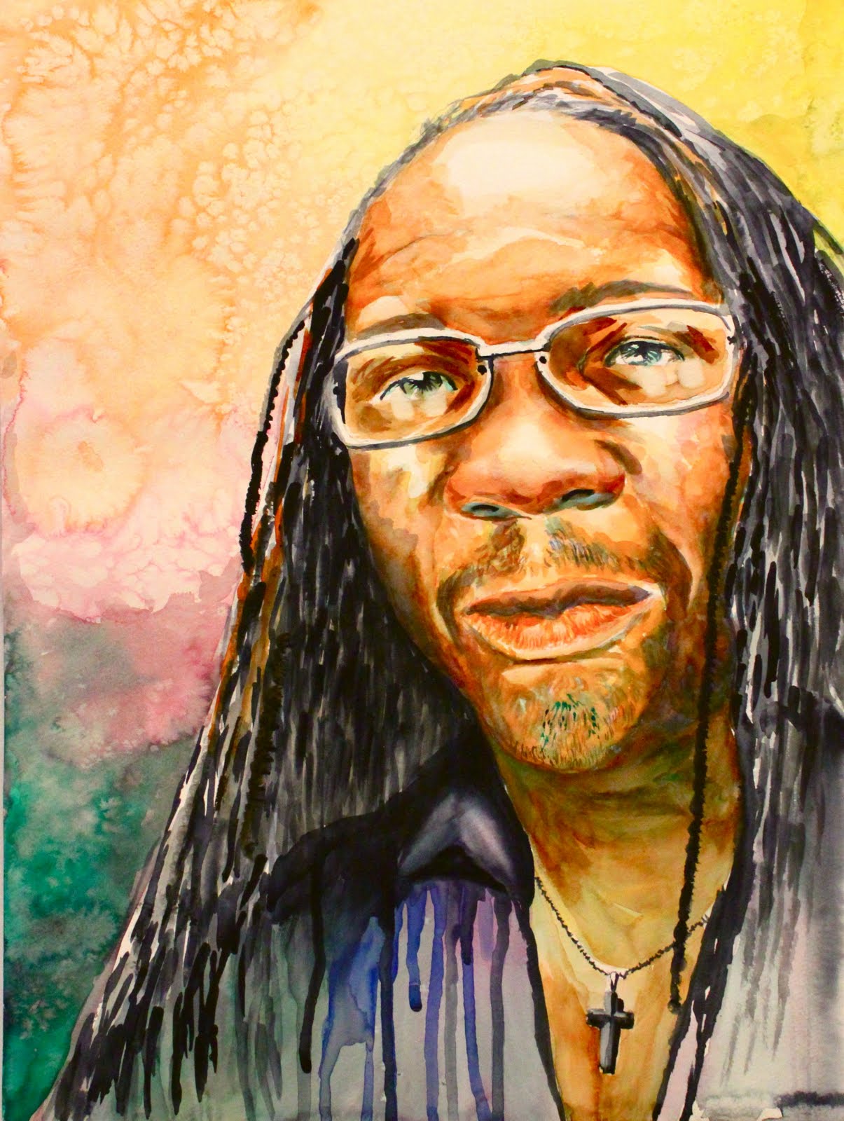 The Result: "The Christian Man", Watercolors on 140 Lbs Paper, 16" x 20", $295.00
I was really happy with the results here.
Demonstration: Step by Step
1. I try to knock out as much transparent work as I can in the beginning. First layer is Veridian and I work from dark values to light with it. Then I will add in the Light Yellow (some call it Lime Yellow) and I will working from light to dark as well.
1. I try to knock out as much transparent work as I can in the beginning. First layer is Veridian and I work from dark values to light with it. Then I will add in the Light Yellow (some call it Lime Yellow) and I will working from light to dark as well.

2. After I start off with the Veridian and Light Yellow I will add in the Mauve (translucent) and begin to play around with the values and textures of the face. When mixed, the Mauve and Veridian Green create a nice blue.
 3. After the Translucent colors are down I begin to add in my sedimentary colors, I layer them right over the translucent layers but I try to keep some of the cool colors present.
5. After putting in the my earth-brown colors (sedimentary) I start the details and add some touches of cool colors to finish off my painting.
The I'm at the the final result.
I hope this demo was helpful and I hope to post more like this in the future. :)
No comments:
Post a Comment